Brewery
Salem, MA
As longtime fans of Notch, we were stoked when asked to help improve their packaging design. With the goal to create more brand equity across products, we created a flexible, type-forward design system that emphasizes consistent brand placement and clear hierarchy. Leaning into the essence of the Notch aesthetic — equal parts American printmaking and music sub-culture — each product design emodies a unique motif that feels handcrafted while retaining flexibility to fit a variety of package sizes and formats.
With nearly a million readers, Hagerty Drivers Club is one the biggest automotive print publications. In 2022 Magnifico ushered in a redesign of the magazine that further distinguishes them as a leader with a strong editorial voice and refined aesthetic. The new design combines timeless design principles, a limited type palette, and high quality photography to create a tight system filled with bold layouts and clear hierarchy. Since the successful launch Magnifico has stayed on to design each subsequent bimonthly issue, further pushing the system to balance freshness with consistency.
Creative Director: Todd Kraemer
Designers-at-Large: Will Thomas & John Magnifico
Chamber Music School & Concert Venue
Camden, ME
The Bay Chamber brand redesign unifies two longstanding pillars of the organization, while exuding an open, accessible, and joyful spirit.
At the center of the identity system is the Bay Chamber logo. A strong symbol created with 16 shapes inspired by f-holes; quite literally the place where a string quartet’s acoustic sound gets naturally amplified. The circular arrangement speaks to community and a mission to gather, share, teach, and celebrate together.
Visit baychamber.org
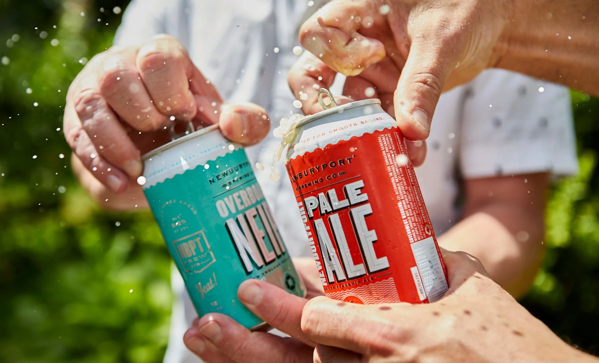
6 years after an exciting brand launch, huge growth, and continued product line expansion, Newburyport Brewing was poised to refresh their packaging. We retained the core look and feel but simplified the system and amped up the volume. The results have helped usher in the next chapter for the brewery and reinvigorated their love for great beer, good music, and community.
Visit nbptbrewing.com
Music School
Boston, MA
Loudlands is an emerging music school that exists to help people find and develop their artistry through private lessons, group classes and workshops. The visual brand is daring and energetic, with an emphasis on bold color, typography and illustrative details. At its center, the braned icon depicts a lightning bolt, created by two opposing Ls, shorthand for Loud Lands.
Visit loudlandsmusic.com
Contract Management Software
Newburyport, MA
Contracts 365 exists to help organizations discover the power of contracts, everyday. The logo is designed with the letters “co” creating an infinity symbol, representing the cyclical nature of business, while the superscript “365” suggests the power of contracts. Throughout the visual identity, colors of the sunrise symbolize the opportunity that each new day brings.
Creative Director John Magnifico
Designer Sadie St. Germain
Copywriting Dave Sandstedt
Neighborhood Burger Joint
Newburyport, MA
Much like the waterfowl of its namesake, The Cormorant is an "expert dive". A hole-in-the-wall type of place. A neighborhood joint for some of the best burgers, sandwiches and brunch around. While the menu is a tribute to the owners' childhoods, the visual brand is a modern twist on retro diner motifs, full of bright colors, photocopied art, and slightly corny jokes.
Visit thecormorantnbpt.com
In 2022, the City of Amesbury partnered with Magnifico to develop a citywide logo system and tagline that aimed to unify its vision and messaging.
At the center of the system is a flexible and colorful logo representing a diverse community, while bridging its innovative past and promising future. The tagline “Make History Here” is an open invitation to continue creating the Amesbury story.
Since rollout, the City has experienced positive growth, reduced vacancies downtown, and employment retention.
Retail Store Concept
Newburyport, MA
Slope To Coast are purveyors of curated chill. This laid back gift shop is inspired by the geographical wonders and distinct seasonality of New England. Relax and rewind with feel good design.
Creative Director John Magnifico
Designer Sadie St. Germain
Bicycle Shop
Traverse City, MI
We love working for brands that are surrounded by tribes of enthusiasts and rooted in passion. We also believe that independent businesses and brick-and-mortar retailers are what give our cities and towns character and soul — especially ones that have been around since 1955. We worked closely with new owners, Hunter and Maggie Gardner, to tune up the look & feel of Traverse City’s oldest cycle shop and help create alignment between their customer base and their business goals.
Art Curator
Minneapolis, MN
We helped owners Hollie & Kelly relaunch their art curation business by creating a brand new visual language and design toolkit that reflects the high-end service they bring to their audience. The wordmark-centric identity and corresponding typographic system are sophisticated and polished, yet personal and human. Vibrant colors reflect the owners’ collective personality and approach. Gestural line art and illustrations depict the process and evoke the joy of art.
artgirlsmpls.com
Flux is a periodic printed dispatch from Myrth. Printed by Newspaper Club on digital tabloid newsprint.
Auto Rentals
Boston, MA
Firmly entrenched in the Boston auto rental market, “Adventure Van Rental” and its new owner called upon Magnifico to help bring to life a new vision for the company moving forward. Reimagined as Landbird, the business’ new name and identity symbolize the ease and effortlessness of a bird in flight, while emphasizing the emotional benefits of road travel. Upon concept completion, we brought the brand to life across a wide range of touch points from a new website, and digital retargeting campaign to print collateral, location signage, and employee uniforms.
As a subset of work within the Hagerty visual brand refresh, we developed a unique graphic and illustration style that supports the automotive lifestyle brand’s youth programs and speaks to a younger audience. The concept comes to life in the form of an activity book, event materials, apparel, and more.
Automotive Lifestyle Brand
Traverse City, MI
What began as a small niche insurance agency has evolved over the decades into an automotive lifestyle brand focused on the love of cars and driving. In 2018 digital agency, Superformula lead a complete overhaul of Hagerty’s online presence, but their core brand identity was lagging behind. Building off that work and in close collaboration with Hagerty's creative leadership, Magnifico unified the brand identity creating a new system based on simple and timeless design principles that works across every touchpoint big and small.
Technology Support Platform
Boston, MA
Onevision has recognized an opportunity to partner with home tech suppliers to profitize customer service & support — a space that is often a pain point or afterthought to the installation process. The new visual brand repositions Onevision as a sophisticated, professional service partner. We created a modernized logo and design toolkit that emphasizes bold color usage and typographic hierarchy, along with graphic elements that support messaging to tell a more clear, succinct story.
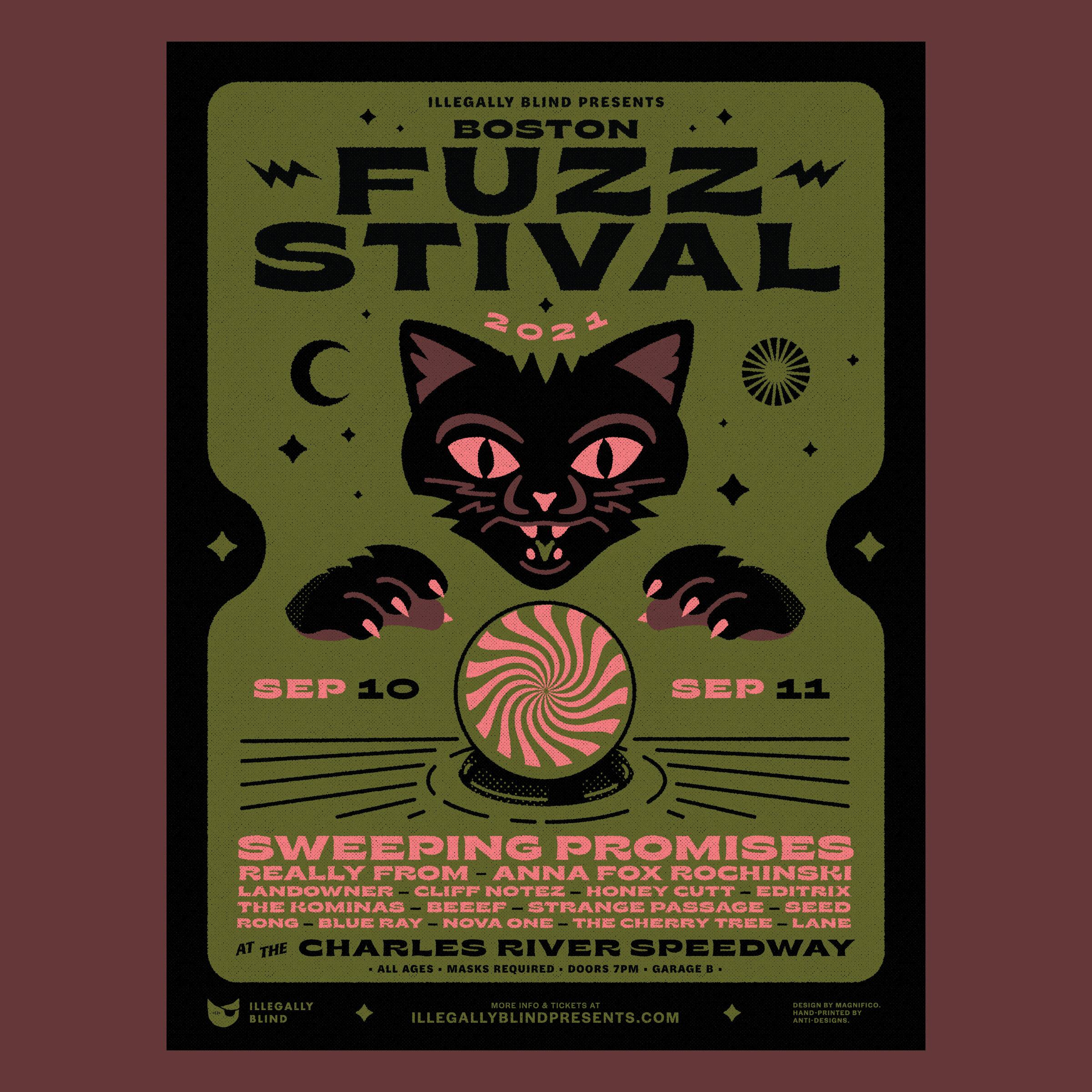
The annual Fuzzstival is back …post-Covid edition! New venue. New poster set.
Automotive Shop
Newmarket, NH
Superduo Ellen & Stefan Food needed a brand identity for their new family owned and operated car shop.
CBD Products
Salem, MA
Family-grown, organic CBD creations, made right here in Essex County. Earth tones and a hand rendered “star leaf” icon anchor a consistent visual brand across a full line of CBD products for wellness, rest, recovery, and better everything.
Visit harmonyharvestcbd.com
Photos by Sara Charles
Ceramics Studio
Somerville, MA
The visual identity of Myrth positions the brand as a leader in modern artisanal ceramics with a refined, cohesive aesthetic that communicates quality, warmth, and intentionality. From its elegant logo to its storytelling-driven photography, every detail reinforces an ethos of timeless design. Our ongoing partnership ensures that every touchpoint reflects the same care and craftsmanship poured into their ceramics.
Visit myrth.us
Cabin and Camping
Waldoboro, ME
This glamping and event destination spans 83 acres of pristine Maine woodland, offering an abundance of activities to reconnect with nature. Magnifico collaborated with owner/proprietor Sarah Pike to bring the brand vision to life, creating an identity system centered around a hand-wrought logo, vintage field guide-inspired illustrations, and a tight color and type palette that capture the spirit of Mid-coast maine camp vibes, authentic farm-to-table cuisine, and starry nights filled with s'mores.
Movie Theatre
Cambridge, MA
Despite the rapid disappearance of American art house theaters, The Brattle has managed to maintain a loyal base of moviegoers while remaining independently operated since 1953.
The new Brattle identity embraces their storied, off-beat legacy, while optimistically looking towards the future.
We looked to the cinematic experience to inform a bold, high-contrast design language: Black/White. Heroes/Villains. Romance/Horror. Sweet/Salty. Rising/Falling. Beginnings/Endings.
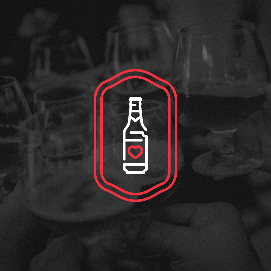
Retail Beer Store
Belmont, MA
It's more than ABV and IBUs. It's passion, community, and craft. Beer Love. It's why we're here.
Car Culture Magazine
Detroit, MI
Since 1958, Autoweek has delivered world-class content to those who love cars. Through the years, and several detours in visual design, however, the magazine’s core identity and personality had faded.
The refreshed brand identity and publication design system more accurately reflects the people and passion behind each issue, and creates a literal and figurative window into the world of car culture.
Public Mobility Initiative
Los Angeles, CA
In December 2019, Urban Movement Labs launched in Los Angeles, with the aim to develop, test, and build solutions to help the city reduce its reliance on single-occupancy vehicles, and also to find new mobility options that could be used in other cities worldwide.
We worked directly with the Mayor’s office and a small team from Verizon, the initiative’s technology partner, to create an identity that feels smart, open, inspiring, and forward-looking.
Craft brewery
Newburyport, MA
In 2011, locals Chris Webb and Bill Fisher quit their jobs and launched one of the fastest growing craft breweries in the history of craft brewing. Since day one, their mantra has been about quality. Quality beer and quality of life. They believe Newburyport, as small as it seems on the map, is the greatest place in the world. Beers are crafted, named, and packaged to reflect the city's rich history, vibrant culture, and quirky colloquialisms.
Cycling Event Posters for EF
Design by John Magnifico & Will Thomas
Illustration by Will Thomas
Snack Brand
Uganda
Beyond ethical sourcing, Amäzi is actively growing and redefining agricultural supply chains from the ground up, by keeping production in the very same country as its ingredient source, creating jobs and local industry.
Our design for Amäzi is optimistic. Ingredient-inspired illustrations, simple, fresh typography, and a cheerful palette are used to create a house style across mediums, while also communicating product variety and line logic.
Outdoor Education Nonprofit
Lander, WY
With courses on six continents, more than 280,000 students trained, and 50+ years of hardcore wilderness expeditions under belt, NOLS has earned its badge as the leader in wilderness education.
At the center of the new NOLS identity is a unifying signature color and refreshed logo that reflects their mission to help you step forward boldly as a leader and take on the challenges of a world in flux.
Beach Café
Ogunquit, ME
Inspired by family picnics at our favorite New England beach-spot, this Ogunquit, Maine café offers “a fresh take on takeaway”. The design reflects their bright, friendly vibe and augments a healthy, modern menu of lemonades, salads, sandwiches, and beach pops.
Plant-based Energy Drink
Brooklyn, NY
Clean energy for daily adventures. Six easy-to-pronounce ingredients. Radically sustainable cascara.
Wine bar & kitchen
Ogunquit, ME
Northern Union is the marriage of wine and seasonal fare in the state of Maine. Vintage travel maps, locally sourced antique imagery, and a refreshing sense of humor serve to evoke a sense of exploration, leisure, love, and friendship throughout the brand and dining experience. We worked closely with proprietors, Matt & Lauren Wickert and rockstar interior designer, Abby Bickel to develop and deploy a consistent vision from naming, identity, collateral, promotional and space design.
Cycling Event
Boston, MA
This citywide benefit ride brings out thousands of cycling enthusiasts, casual peddlers, and pro riders alike. When EF took over title sponsorship in 2018, they asked Magnifico to develop a core logo and look & feel — marrying their corporate brand with the city’s freshly unveiled brand system — to be used for years to come.
Furniture Designer
Boulder, CO
Leaf Woodworking makes heirloom quality wooden goods. Their visual identity reflects an American craftsmanship and minimalist Scandinavian aesthetic found throughout the Leaf product line. The linear geometry of the logo nods to the maker’s signature cedar inlays found in many of their pieces.
Nature conservation nonprofit
Lincoln, MA
In 2017, we developed a brand strategy and creative platform to help Massachusetts’ largest nature conservation nonprofit look to the future with a consistent message, tone, and visual look & feel.
Leatherworkers
Lewiston, ME
The methods of making beautiful and functional objects from simple materials go back centuries to the Maine-native Passamaquoddy. It is here, that Quoddy stubbornly resists trading human touch for industrial efficiency. From their workshop in Lewiston, they stitch, coax, and charm these humble materials into beautiful footwear. We have worked closely with Quoddy to revitalize, refine, and reimagine the possibilities for their brand, while preserving their heritage.
Brand-to-Retailer Marketing Platform
Boston, MA
Promoboxx is a digital marketing platform that connects retailers to the brands they carry, empowers them with the right tools to engage their customers, and instill confidence to go up against big box and online retailers.
Supporting a mission to root for the underdog, is a design system centered around the colorful personalities of the brick-and-mortar, mom-and pop, and small-and-mighty shops that bring uniqueness to our communities. An open box logo suggests approachability and accessibility, while a hidden double “xx” subtly nods at the Promoboxx name.
Mighty Roots designs and builds homes and custom cabinetry in the Southern New Hampshire and Maine region. The company's new name and visual identity highlight a commitment to building happy homes that stand the test of time and become fundamental to the growing of happy communities.
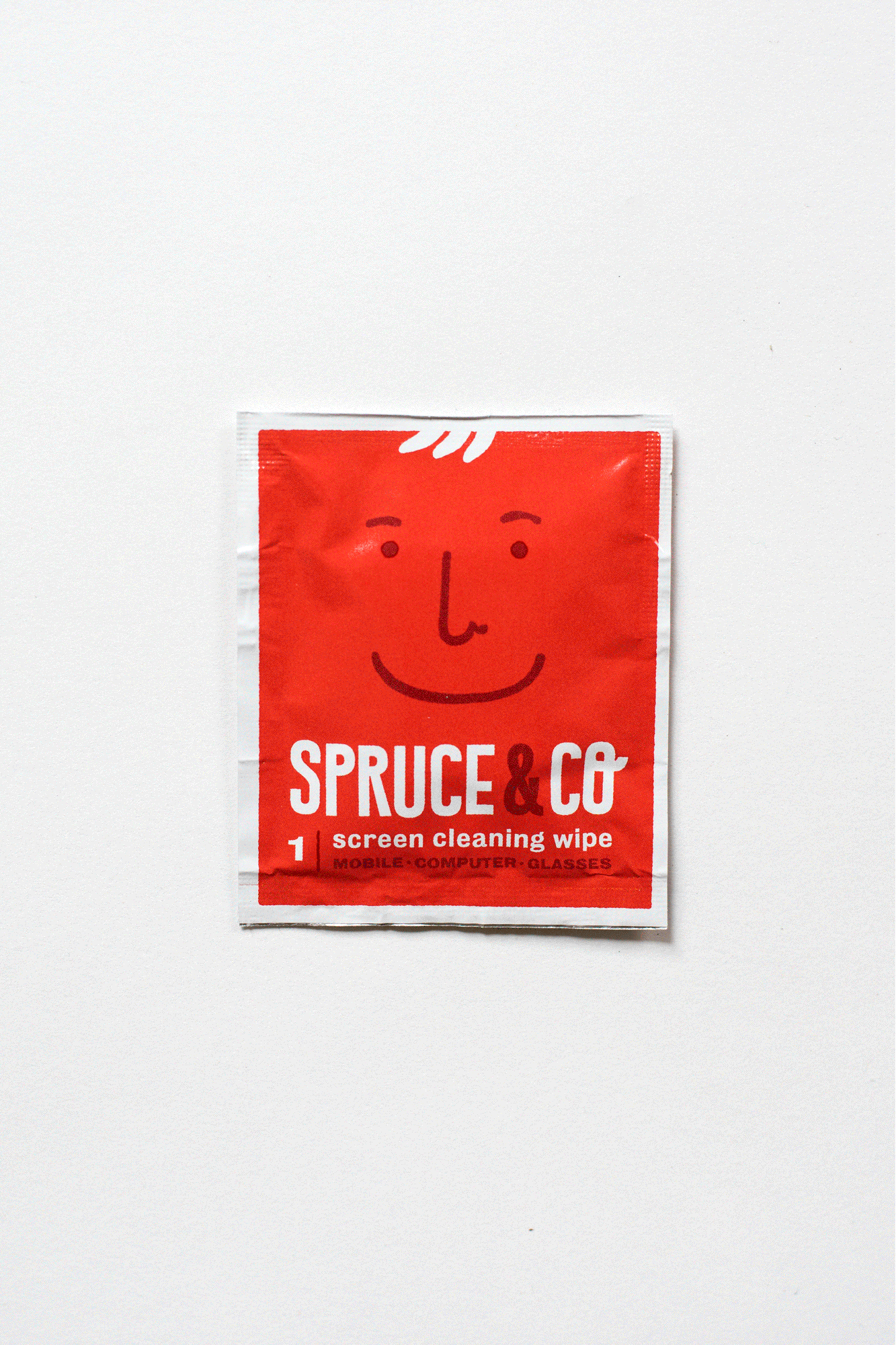
Cleaning products
New York, NY
Spruce & Co. promotes happiness and health through a line of natural cleaning products.
The brand language is centered around colorful illustrations depicting "The Sprucies" — a family of cheerful faces, your cleaning buddies, your little helpers.
Purveyor of fine teas
Portland, OR
With a menu as streamlined as the white-walled interior, Erica Indira Swanson's vision for her tea house is simple — focus on quality, not quantity. In a sea of quirky coffee roasters, high-design cafés, and Portland-esque bars, Tea Bar stands out as a refreshingly simple, chic tea house. The minimalist brand is designed to augment the thoughtfully curated tea menu, without distracting from it. A singular-line logo mark reflects the simplicity of the tea drinking experience.
Online art marketplace
San Francisco, CA
Brand refresh for the world's finest online creative community and marketplace of unique and impossibly brilliant art on products. Working closely with San Fran-based Hub Strategy, we crafted a look and feel that reflects the artistry of Redbubble creative community.
visual identity evolution, art direction, custom typefaces & illustration, campaign development.
Consumer research agency
Boston, MA
Thoughtful and stylish brand identity for a Boston-based consumer research firm that provides clarity into how brands live in consumers' minds.
A minimalist design approach provides Theory with the tools to communicate their complex, psychologically-driven data to partnering agencies and clients, and reflects the clarity they strive to obtain through their research methods.
Gourmet baking company
Boxford, MA
Zesty Cookies are not your kids' cookies. Created with a hint of cayenne pepper, Zesty Cookies are all-natural bold treats for a mature palate. Big, bold typography and vibrant colors pop off craft paper packaging, reflecting a fun, sassy attitude, shared by the company's owners and their distinctive treats.
Skateboard builder
Portland, ME
Sad Lumberjack creates longboards, or as they put it "bad ass goods from reclaimed wood". Each board is made from discarded wood that once had a previous life — log cabin siding, fence posts from the 1920s, scrap wood from adirondack chairs, or pallets found on the side of the road.
Music festival
Cambridge, MA
Fuzzstival blissfully unites the best of Boston's psychedelic, shoegaze, dreampop, space, wave, and rock scenes each year for one loud weekend in August.
An omnipresent eye, augmented by a "fuzzy kitty" has organically become the Festival's trademark motif over the past three years. Wavy, dreamlike typography and vibrant blissful color were introduced in 2015 for the festival's third and largest billing yet.
Boston, MA/Louisville, KY
Visual Identity and custom illustration for a remote digital agency.
Luthier/guitar repair shop
Somerville, MA
As the guitarist in bands such as Velah and Pale Hands, Nick Murphy has an enthusiasm for not only playing, but also building and repairing the instrument he loves. We created a strong identity that reflects the honest labor of repair work, and the face-melting attitude of rock and roll. At the center of the brand is a hexagonal monogram logo mark, taking shape from a key guitar repair tool — the hex wrench.
Footwear Licensing
Newburyport, MA
KloneLab understands brand DNA.
Technology Company
New York City
Intersection uses digital technology to transform the physical world.
Designed with Will Thomas
In-home ice skate sharpener
Boston, MA
Visual language and website design.
Album concept and artwork
Exist is the howl of the hawk. The rattle of snakes. The dance of the tiger. Crude, illustrative depictions of an animalistic world letting all out, capture the raw, loud, and visceral spirit of Boom Said Thunder's debut album and first major statement of recorded music.
Chicago, IL
Shopping App
Visual Identity for startup product referral social network.
Distillery
Lynchburg, TN
Responsive website redesign for the #1 selling whiskey brand worldwide.
Nomadic Museum
Boston, MA
Design Museum Boston concepts and facilitates pop-up exhibits throughout the Boston metro area that educates people on the role of design. The identity features a modular system that insinuates the concept of people coming together.
Client: Design Museum Boston,
Designed with Bryant Ross & Peter Strutt
Non-profit tutoring & writing center
Boston, MA
The national chain of non-profits, founded by novelist Dave Eggers, has redefined writing centers by integrating each one with a fantastical store. In Boston, the Bigfoot Research Institute uses cryptozoology starter kits and Yeti hairballs to engage children and raise funds for programming. A refreshed brand language and series of promotional materials featuring bold typography, vibrant colors, and custom illustration capture the experience of fun, creativity and a bit of strangeness that 826 Boston provides.
Selected Works
(Almost) every logo we’ve ever made